Translate.video Product Rethink
Translate.video is an AI-powered video localization platform that helps creators, teams, and businesses translate and repurpose video content for global audiences. The product supports workflows such as video dubbing, subtitle translation, text-to-speech, voice cloning, and lip-sync generation, allowing users to create multilingual videos faster without relying on complex manual editing processes.
Product Designer
2025 — 2026
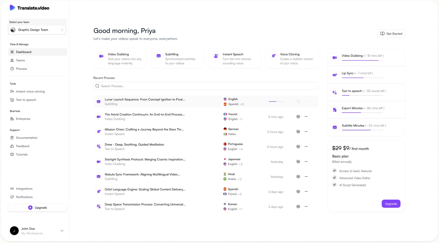
Designed the end-to-end experience for Translate.video at Vitra.AI, contributing across problem framing, user flows, wireframes, interaction design, and final UI. The goal was to create a scalable, intuitive product experience for video dubbing, translation, voice cloning, and text-to-speech workflows.
Timeline
Feb - Jun (2026)
Platform
Web Application
My Role
UX/UI Designer
Tools used
Figma, Design system, React JS
Introduction
Translate.video is an AI-powered video localization product by Vitra.AI that helps teams translate, dub, subtitle, and adapt video content for global audiences. As the product expanded across multiple workflows, the interface needed to become more consistent, scalable, and easier to use.
The goal was to create a cleaner and more reliable experience that could support current translation workflows while also providing a strong foundation for future product features.
My Role
I contributed to the end-to-end redesign of Translate.video, working across research, problem framing, user flows, wireframes, interaction design, and final UI execution. My role focused on improving the product experience, creating reusable components, refining the visual language, and ensuring the design was scalable across key workflows such as video dubbing, subtitle translation, voice cloning, and text-to-speech.
I also collaborated closely with engineers to ensure a smooth design handoff and maintain consistency between design and implementation.
Problem
As Translate.video expanded across multiple AI-powered workflows, the product experience became harder to navigate and less consistent. Users needed to manage uploads, select languages, choose output types, track usage, and access different tools from one place, but the existing interface did not clearly support these actions.
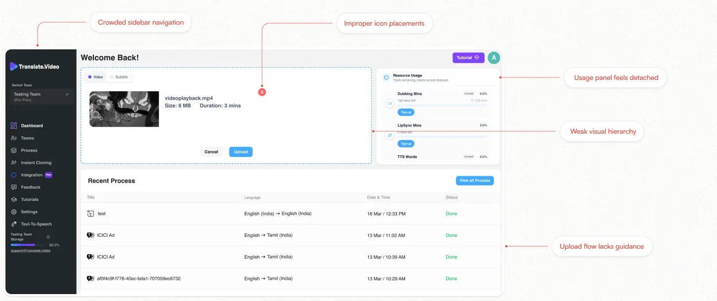
Dashboard (~Before)
PROBLEM #01
Crowded side-bar navigation
The old sidebar contained too many navigation items with almost the same visual weight. Core product actions like Dashboard, Process, Instant Cloning, Integration, Settings, Tutorials, Feedback, and Text-to-Speech were placed together without clear grouping. This made the navigation feel heavy and difficult to scan.
IMPACT
Users had to spend more time understanding where to go next. The product also became harder to scale because every new feature added more clutter to the same navigation area.
PROBLEM #02
Weak visual hierarchy
The dashboard did not clearly prioritize the most important actions. The upload area, resource usage card, recent process table, tutorial button, and sidebar were all competing for attention. There was no clear visual flow guiding the user from “start a task” to “complete a task.”
IMPACT
Users could feel unsure about what to focus on first. This increased cognitive load and made the dashboard feel less polished, even though the required features were present.
PROBLEM #03
Upload flow lacks guidance
The upload section allowed users to add a video, but it did not explain the workflow clearly. Users could see video/subtitle options, file details, cancel, and upload buttons, but the next step after upload was not obvious. The section felt like a drop area rather than a guided product workflow.
IMPACT
Users could hesitate before taking action because the system did not clearly communicate what would happen next. This reduced confidence during one of the most important actions in the product.
PROBLEM #04
Usage panel feels detached
The resource usage panel was placed on the right side, but it felt disconnected from the upload and translation workflow. It showed dubbing minutes, lip-sync minutes, and TTS words, but the information was compressed and not clearly connected to the current task.
IMPACT
Users could see their usage limits, but they may not understand how those limits affect the action they are about to perform. This made the usage information feel informative, but not very actionable.
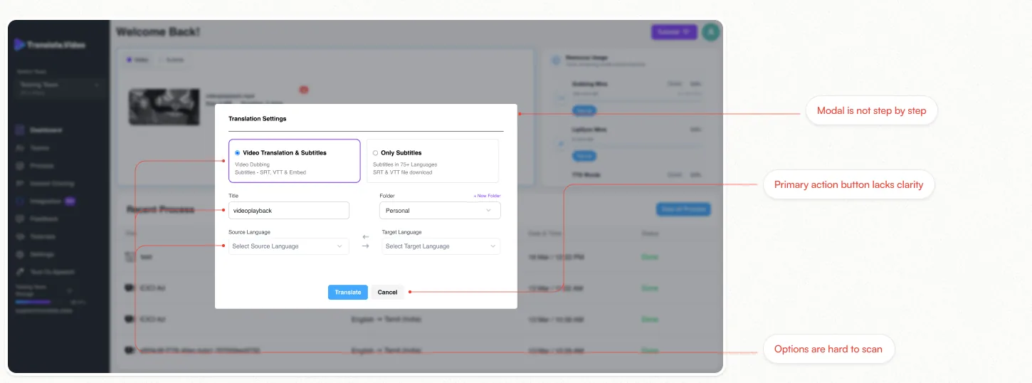
Upload Modal (~Before)
PROBLEM #01
Recent process table is hard to scan
The recent process section used a basic table layout with limited visual distinction between rows. Some project names were unclear or system-generated, and the table did not highlight project type, language details, progress, or quick actions in a readable way.
IMPACT
Users had to spend more effort identifying previous projects. Returning to an existing task became slower, especially when multiple projects had similar names or repeated language combinations.
PROBLEM #02
Weak visual hierarchy
Some icons and controls were placed without a clear visual relationship to the elements they affected. For example, the remove icon in the upload area appeared isolated, and multiple small icons in the sidebar and table did not always support quick understanding.
IMPACT
Users could feel unsure about what to focus on first. This increased cognitive load and made the dashboard feel less polished, even though the required features were present.
PROBLEM #03
Modal based workflow feels cramped
The translation settings flow was placed inside a small modal. Important decisions such as output type, title, folder, source language, and target language were all shown together in one compact space. The modal did not feel like a step-by-step workflow.
IMPACT
Users had to process many decisions at once, which made the workflow feel heavier than necessary. The limited space also made the task feel less important and less focused.
PROBLEM #04
Inconsistent button hierarchy
Primary and secondary actions were not always clearly differentiated. The old UI used different button styles across upload, top-up, translate, cancel, and tutorial actions. Some important actions did not stand out enough, while some secondary actions had similar visual weight.
IMPACT
Users could hesitate because the interface did not clearly show which action was primary. In task-based workflows like uploading and translating videos, unclear button hierarchy can slow down completion and increase errors.
Editor page (~Before)
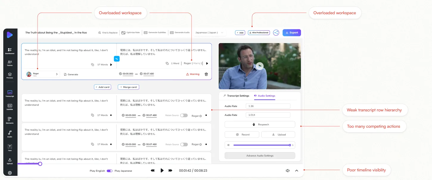
PROBLEM #01
Overloaded workspace
The editor screen contains too many active areas at once: transcript rows, translated text, speaker controls, timing controls, video preview, audio settings, top toolbar actions, side navigation, and bottom playback controls. All of these are visible together without a clear priority.
IMPACT
Users may feel overwhelmed while editing. Since translation editing requires focus, the crowded workspace increases cognitive load and makes it harder to concentrate on the actual transcript and translation task.
PROBLEM #02
Weak transcript row hierarchy
Each transcript block contains many elements such as source text, translated text, speaker name, word count, play icons, timing, retain source toggle, warning status, and delete action.
IMPACT
Users may struggle to quickly scan each segment, identify errors, or understand what needs attention. This slows down editing, especially when working with long videos that contain many transcript rows.
PROBLEM #03
Poor timeline visibility
The old editor had only basic playback controls, with limited visual context for video structure, audio waveform, or transcript segment placement. It did not clearly show how text, voice, timing, and video playback were connected.
IMPACT
Users had to rely on repeated playback to understand where edits were happening, making timing adjustments slower and less confident, especially for longer videos.
PROBLEM #04
Speaker and voice controls were hard to understand
Speaker and voice controls were mixed with other row-level actions like timing, play, warnings, and generate options. This made it harder to understand which speaker or voice was assigned to each segment.
IMPACT
Users could feel unsure while managing voices across multiple transcript rows, increasing the chance of incorrect speaker assignment and slowing down the dubbing workflow.
Text to speech (~Before)
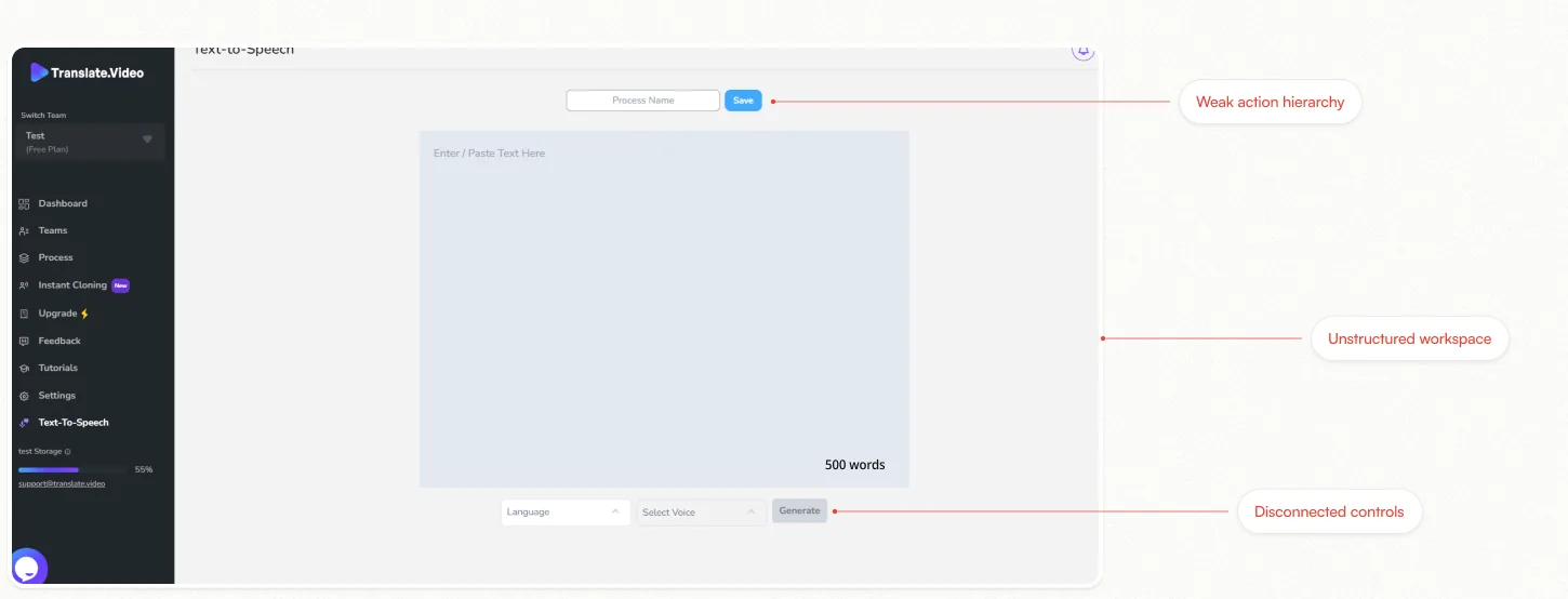
PROBLEM #01
Unstructured workspace
This Text-to-Speech screen used a large empty canvas with loosely placed controls, making the experience feel unfinished and visually unbalanced. Key elements like process name, text input, and generation controls were not grouped into a clear workflow.
IMPACT
Users had to scan the page to understand where to begin. The lack of structure made the workflow feel less guided and reduced confidence while creating speech from text.
PROBLEM #02
Disconnected controls
Language, voice, and generate actions were placed at the bottom of the screen, visually detached from the main text area. Unlike the redesigned version, the old layout did not connect content entry with the settings needed to generate speech.
IMPACT
This separation made the task flow harder to follow and increased the mental effort required to complete a simple text-to-speech action.
PROBLEM #03
Weak action hierarchy
The screen showed both Save and Generate actions, but their relationship was unclear. The primary next step was not strongly emphasized, and the interface did not clearly guide users from writing text to configuring settings and generating speech.
IMPACT
Users could hesitate before taking action because the workflow did not clearly communicate the most important next step. This slowed task completion and weakened usability.
Timeline editor (~Before)
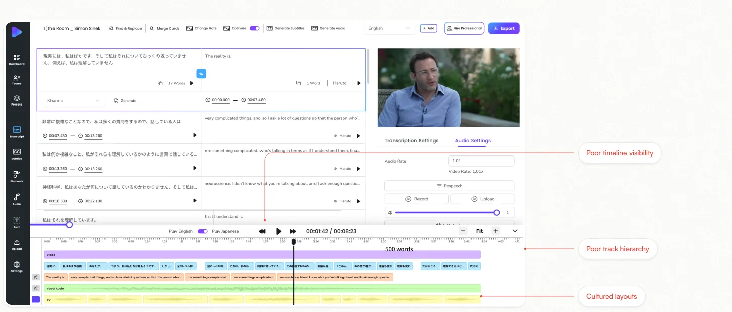
PROBLEM #01
Cluttered & dense layout
The old timeline was visually crowded with too many elements, small text, and tightly packed controls, making it difficult to focus on important content.
IMPACT
Users felt overwhelmed while editing and struggled to quickly identify the right segment, leading to slower workflows.
PROBLEM #02
Poor track hierarchy
Video, dialogue, source, target, and audio tracks were not clearly separated, making it difficult to understand what each layer represented.
IMPACT
Users could make selection or alignment mistakes, increasing rework and reducing editing accuracy.
PROBLEM #03
Limited timeline visibility
The timeline had limited zooming, unclear waveform visibility, and less context across the full duration of the video.
IMPACT
Users had to repeatedly scroll and zoom to find specific sections, making navigation slower and less efficient.
Export Modal (~Before)
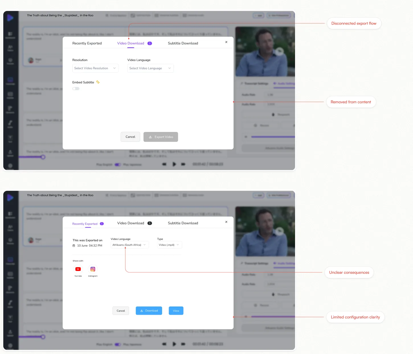
PROBLEM #01
Disconnected export flow
Different tabs for Video, Subtitle, and History created separate workflows and broke the user’s mental model.
IMPACT
Users had to switch between contexts and spend more time figuring out where to start.
PROBLEM #02
Removed from context
Export opened in a modal that pulled users away from the editor and the content they were working on.
IMPACT
Users lost context, which increased cognitive load and slowed the workflow.
PROBLEM #03
Limited configuration clarity
Options were minimal and scattered. Users couldn’t clearly see languages, formats, or subtitle settings together.
IMPACT
Users were unsure about what they were exporting until the last step.
PROBLEM #04
Unclear consequences
It wasn’t obvious how many languages were selected, what the export would cost, or how subtitles would be included.
IMPACT
Users faced uncertainty and were more likely to make mistakes.
What actually changed
Before:
- Features were distributed across multiple navigation levels
- Timeline, transcript, audio and video competed for attention
- Important actions were hidden inside secondary controls
- Users had to understand the product before knowing what to do
- Settings and editing controls felt disconnected from the work
- Large areas of the interface carried little useful information
After:
- Core workflows are surfaced directly where users need them
- Content, controls and timeline are organized into a clearer hierarchy
- Primary actions are placed closer to the content they affect
- The interface guides users through the editing workflow
- Contextual controls appear alongside the content being edited
- Workspace is structured around the user’s active task
Things that didn’t work — And how I solved them
The Problem
The old editor brought transcript, translation, video, audio controls, and the timeline into one workspace, but the relationships between them were unclear. With weak hierarchy and actions separated from the content they affected, users had to scan across the interface and move between different areas to understand what to edit, what action to take, and how those changes would affect the final video.
What worked
We restructured the experience around a clearer content → action → media → timeline relationship. Editing content now has stronger visual priority, relevant actions such as speaker selection, generation, and lip sync sit directly alongside the content they affect, and the timeline is integrated through clearly defined Video, Dialogue, and Audio tracks.
Impact
The new structure reduces cognitive load and unnecessary navigation, helping users understand the editing workflow faster and see the connection between their changes and the final output. The experience feels more focused and predictable without removing the complexity required for professional video localization.

Good UX is about reducing the distance between intent and action.
The biggest improvement wasn’t adding more functionality, It was bringing existing functionality closer to the user’s context. When the content, action and result are visually connected, users spend less time figuring out where to click and more time actually editing.
Complex products need hierarchy more than simplicity.
An enterprise video editor cannot remove every control. The better approach is to decide what deserves attention now, what can stay secondary, and what should only appear when relevant. The redesign made the product feel simpler without removing the underlying complexity.
The timeline should explain the output, not just represent time.
A timeline becomes much more useful when users can understand the relationship between video, dialogue and audio at a glance. Structuring those layers around the actual production workflow made the timeline easier to reason about.
Contextual controls beat hidden functionality.
A control is only useful when users can recognize when and why to use it. Moving actions next to the content they affect made the interface more discoverable without adding extra instructions.
The best redesigns remove cognitive work, not functionality.
The goal wasn’t to make Translate.video less powerful. It was to make the existing power easier to understand, navigate and use.
Explore More
Get My Stock
A 0 to 1 B2B ordering app for small retailers — problem framing through to a shipped first release.
Aero UI Design System
A component library and token system built to keep a fast-moving product visually consistent.
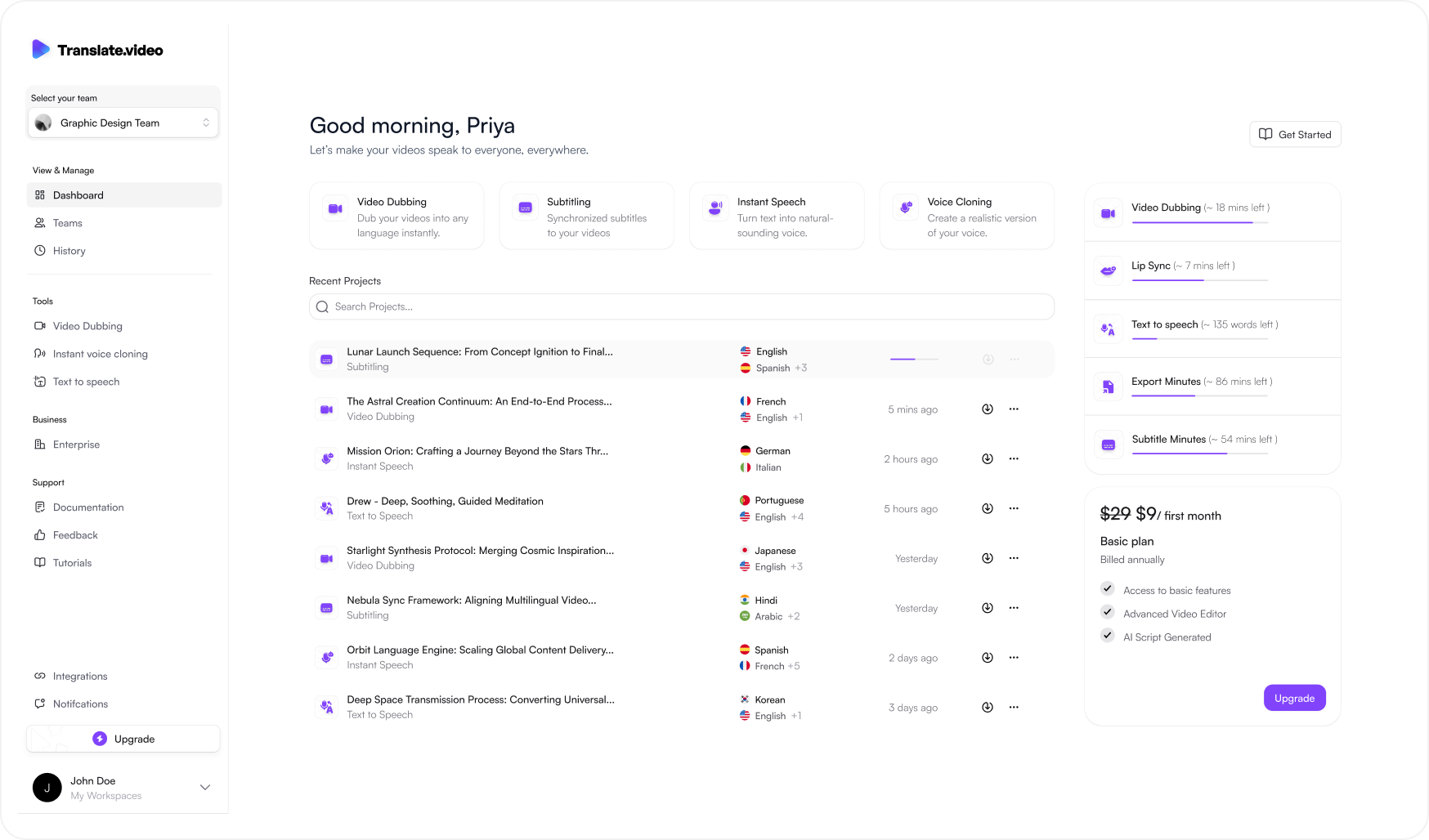
Translate.video V2
Rethinking an AI video localization platform across dashboard, editor, timeline and export.