Get My Stock, 0→1 B2B Mobile App
I led the end-to-end design from concept to launch, taking the product from an early idea to live. My work covered the problem framing, user flows and information architecture, wireframes and interaction design, and the final UI/visual language. I also built a reusable component system and partnered closely with engineer’s to deliver a first release and a strong foundation for future iterations.
Product Designer
2024 — 2025
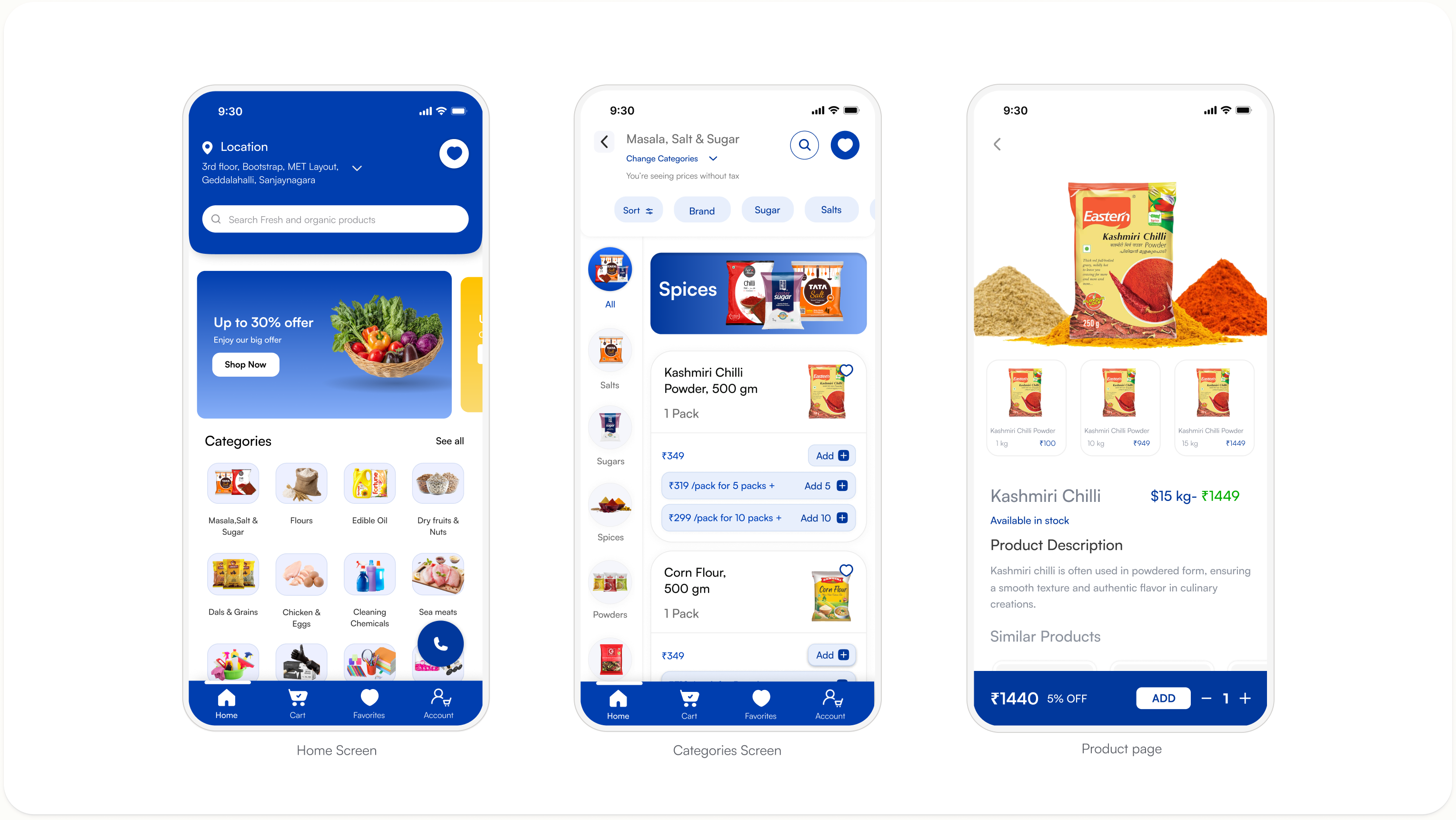
I was a Founding product designer at Get My Stock, where I led the design of a complete B2B App and led the end-to-end design from concept to launch, taking the product from an early idea to live
Timeline
Oct 2024—Mar 2025
Platform
iOS & Android App
My Role
Product Designer
Tools Used
Figma, Flutter
Introduction
Get My Stock is a B2B procurement app built for small and medium-sized retailers to streamline how they source and restock inventory. The platform connects retailers directly with distributors and wholesalers, enabling faster ordering, real-time stock visibility, and flexible payment option, all from a single app. Get My Stock aims to digitise the traditionally fragmented supply chain experience for India’s retail ecosystem.
In this project, we built the entire product from the ground up, designing and shipping the app across both iOS and Android within a focused six-month sprint.
My Role
I was the Founding Product Designer for Get My Stock, owning the end-to-end design process from early ideation through to the live product launch. I worked closely with the founding team, product managers, and engineering leads to define the core user experience, establish the design system, and ensure every screen was production-ready.
Problem
Small retailers in India still rely heavily on phone calls, WhatsApp messages, and in-person visits to reorder stock from their suppliers. This process is slow, error-prone, and lacks any visibility into pricing, availability, or order status. Here are the key problems with the existing experience:
- No centralised platform to browse and order from multiple distributors at once
- Pricing is inconsistent and not transparent across suppliers
- Retailers have no real-time visibility into stock availability or delivery timelines
- Payment and credit terms are managed entirely offline, causing delays and disputes
PROBLEM #01
No Way to Browse Stock Digitally
Retailers had no structured way to discover or browse products from their distributors. Everything was word-of-mouth or catalogue-based, making it impossible to shop efficiently.
IMPACT
Impact Without a browsable catalogue, retailers wasted hours sourcing products and frequently missed items they needed.
PROBLEM #02
No Real-Time Visibility
Description Retailers had no live view of what was in stock, what was on offer, or what was being delivered to their area — making planning nearly impossible.
IMPACT
Impact Blind ordering led to frequent fulfillment failures, eroding trust between retailers and distributors.
PROBLEM #03
No Product Information
Description Retailers had little to no information about the products they were buying — no descriptions, no pack sizes, no ingredients, and no alternatives shown.
IMPACT
Impact Lack of product detail led to wrong orders, returns, and retailer frustration.
PROBLEM #04
No Structured Checkout or Order Summary
Retailers had no clear way to review, confirm, or manage their orders before finalizing a purchase. There was no itemized summary, no way to apply discounts, and no visibility into delivery timelines making the checkout process entirely guesswork.
IMPACT
Without a structured checkout, retailers made frequent ordering errors, missed distributor offers, and had no way to plan stock replenishment without knowing when their order would arrive.
Issues Solved
The product addressed each problem turning a slow, offline process into a fast, transparent, and easy-to-use experience for retailers and distributors.
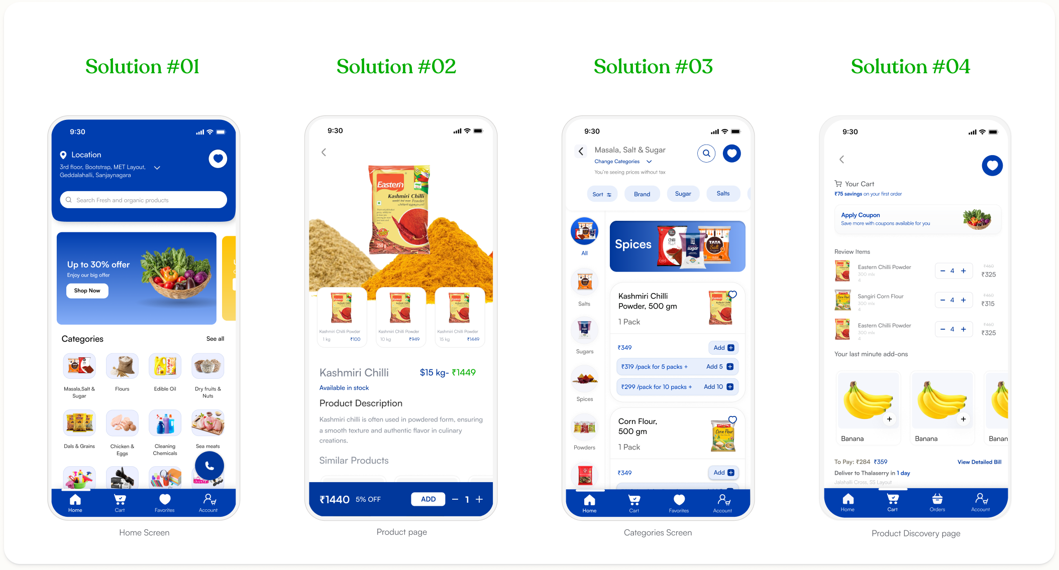
SOLUTION #01
Stock is Now Browsable Digitally
Stock is Now Browsable Digitally Retailers can browse a fully structured digital catalogue, search products by name, and explore deals all from one screen. The days of relying on word-of-mouth or physical catalogues to place an order are gone.
SOLUTIONS #02
Real-Time Visibility at Every Step
Live stock status is now visible at every stage of browsing. Retailers know exactly what's available, what's on offer, and what can be delivered before placing a single order.
SOLUTIONS #03
Complete Product Information, Always
Always Every product has a dedicated page with imagery, descriptions, weight variants, pack sizes, and similar product suggestions. Retailers have everything they need to make a confident, informed purchase without any guesswork.
SOLUTIONS #04
Checkout is Now Guided and Frictionless
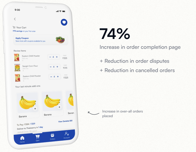
Everything together itemized order review, coupon application, last-minute add-ons, and a clear total with delivery timeline. Retailers can complete their order confidently with full visibility into what they're paying and when it arrives.
How might we build a better experience for consumers to save more on their daily life style?
Defining the problem
How might we build a better experience for retailers to restock faster and run their business more efficiently?
Business Goals
Build a scalable B2B procurement platform We created an end-to-end ordering experience that connects retailers directly with distributors making Get My Stock the default restocking tool for small and medium retailers in India. Operational efficiency We built scalable design components across catalogue, ordering, and payment flows reducing friction for both retailers and distributors on the platform.
User Goals
Faster, easier restocking To give retailers a single place to browse products, check live availability, compare prices, and place orders cutting down the time spent on calls and manual coordination every day. A reliable, consistent ordering experience To ensure every part of the app from product discovery to checkout feels trustworthy, predictable, and easy to use, even for first-time digital buyers.
Impact
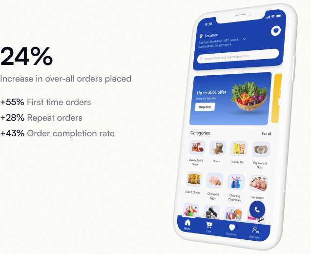
As this was a zero-to-one product, we shipped the app in phases starting with core catalogue and ordering flows, followed by payments and order tracking. For confidentiality reasons, I have omitted the actual business metrics.
A structured design system that maintains visual consistency and improves the collaboration by standardizing UI components and design guidelines.
A structured design system that maintains visual consistency and improves the collaboration by standardizing UI components and design guidelines.
Design System
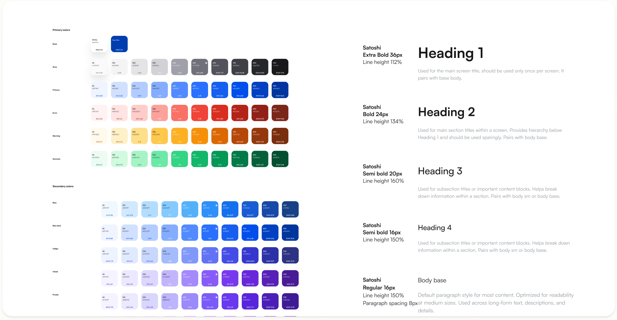
Satoshi typography ensures clear hierarchy and readability, while the primary color #003EAF strengthens brand identity and highlights key interactions.
Design System
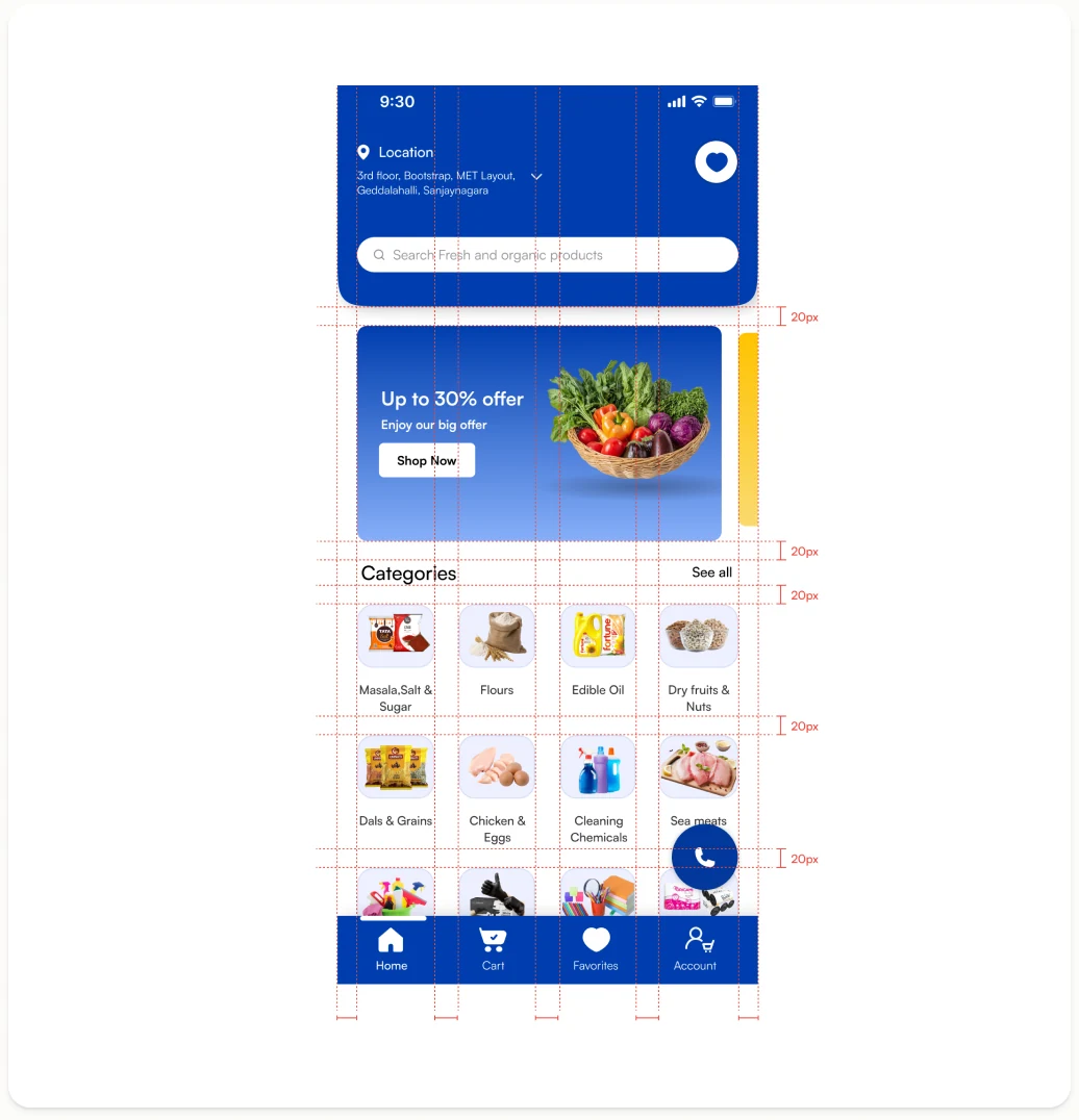
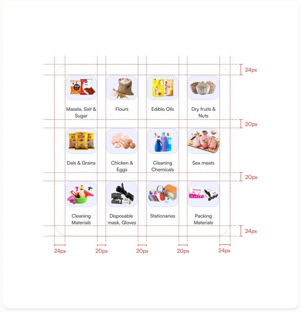
Home Page Consistent 20px grid spacing keeps content breathable, with aligned card components and clear visual hierarchy guiding users to key actions at a glance.
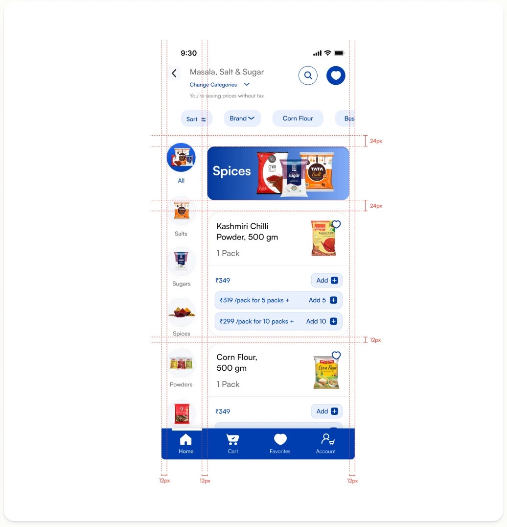
Categories Page A uniform 12px & 24px gap between category tiles ensures a balanced grid layout, with left-aligned labels maintaining readability across all screen sizes.
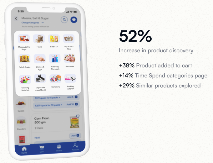
Change Categories Modal Centered modal with 20px & 24px internal padding creates focused content areas, while evenly spaced options reduce visual clutter and improve selection clarity.
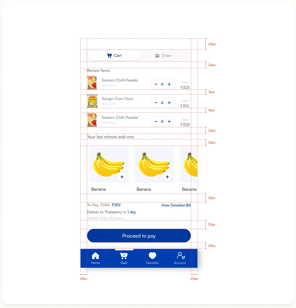
Cart Page Item rows follow a strict 8px baseline grid, with right-aligned pricing and consistent 16px section spacing making the summary easy to scan before checkout.
Tapping a category triggers a subtle scale-up animation, giving users instant visual feedback before navigating deeper into the app.
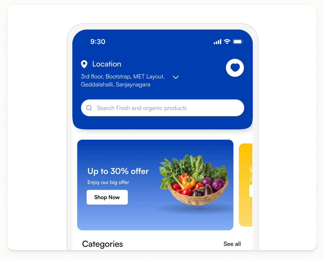
The promotional banner smoothly slides in on load, drawing attention to active offers without disrupting the browsing experience.
A clean fade-in on launch sets the brand tone, easing users into the app with a polished and confident first impression.
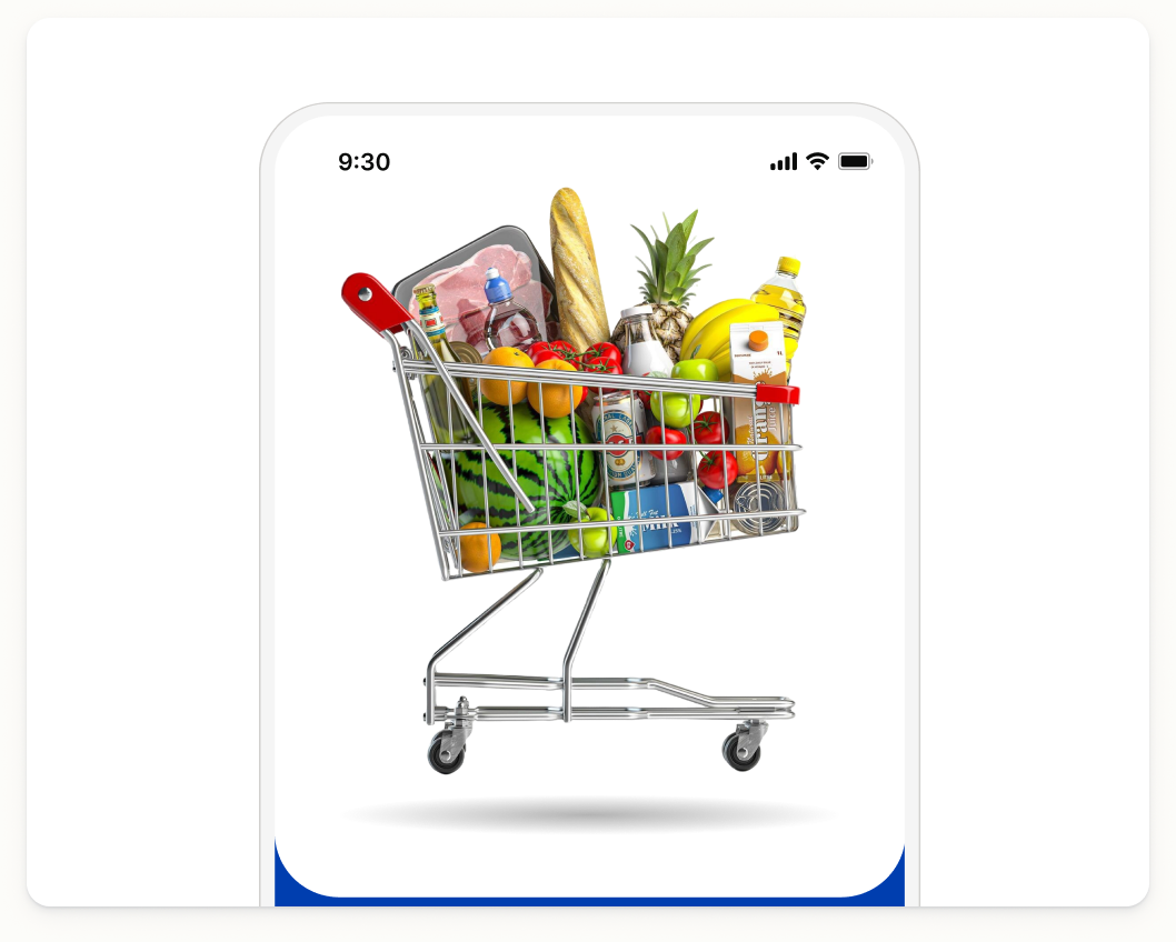
A bounce animation on the cart icon confirms the action keeping users informed without interrupting their flow.
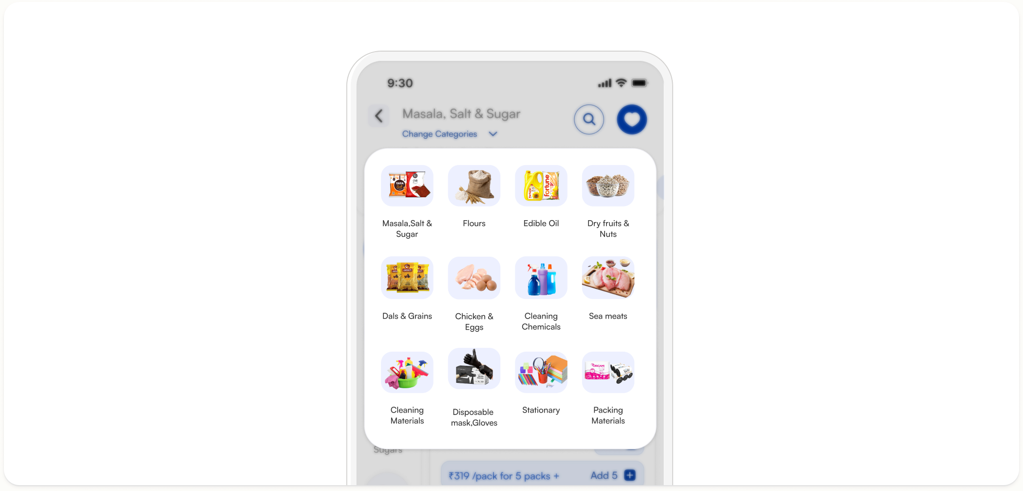
Switching categories triggers a smooth horizontal slide transition, helping users maintain context as they browse across different product sections.
Components
As Get My Stock scaled, inconsistent UI patterns made it harder for users to navigate and trust the platform. Here are the key issues that shaped the component redesign:
Spacing
We established a base-4 spacing token system a fixed set of values (4, 8, 12, 16, 20, 24, 32, 48px) that every component and layout is built from. This replaced the padding decisions that were causing inconsistencies across the product, ensuring whitespace feels intentional and consistent regardless of who designed or built the screens.
Micro - interactions
Small, intentional animations that guide users through the app — making every tap, swipe, and transition feel responsive and natural.
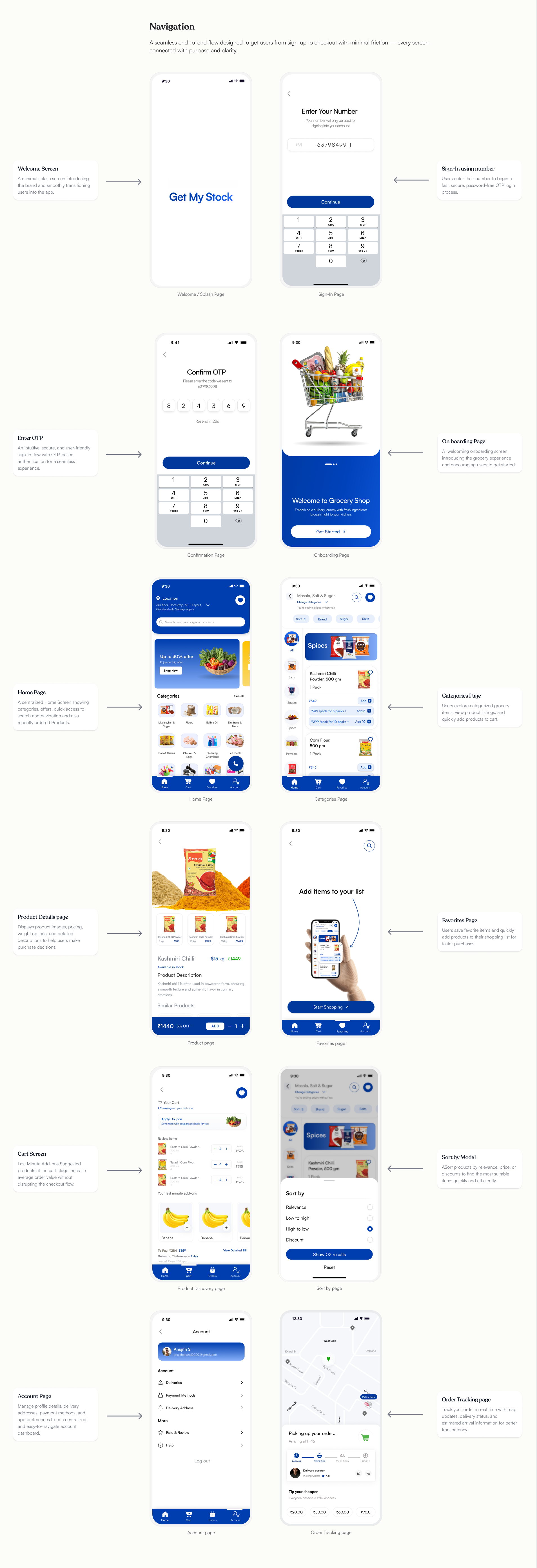
Navigation
A seamless end-to-end flow designed to get users from sign-up to checkout with minimal friction — every screen connected with purpose and clarity.
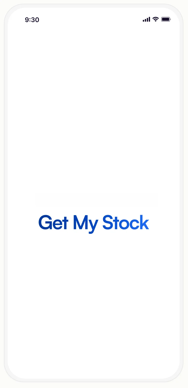
Welcome Screen
A minimal splash screen introducing the brand and smoothly transitioning users into the app.
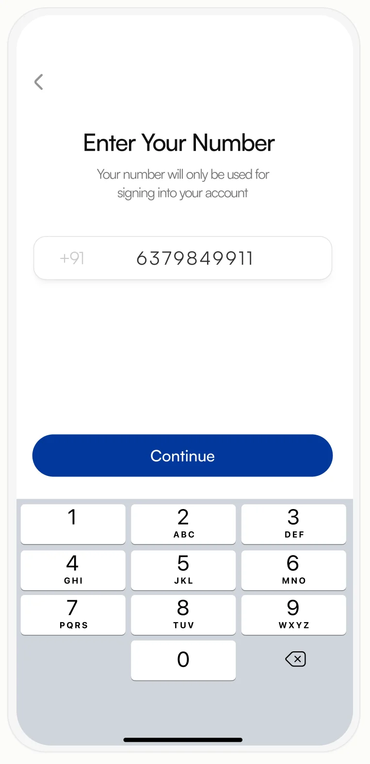
Sign-In using number
Users enter their number to begin a fast, secure, password-free OTP login process.
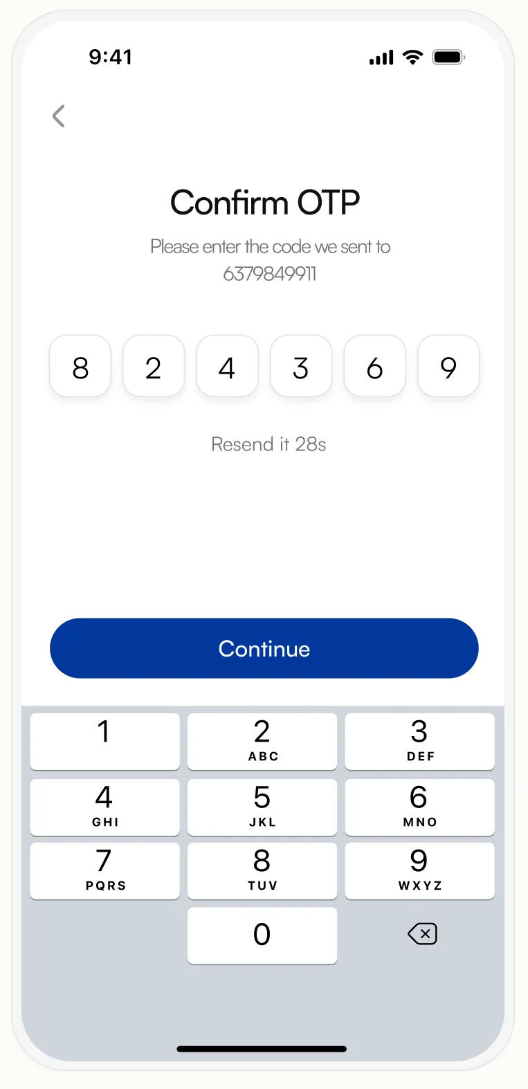
Enter OTP
An intuitive, secure, and user-friendly sign-in flow with OTP-based authentication for a seamless experience.
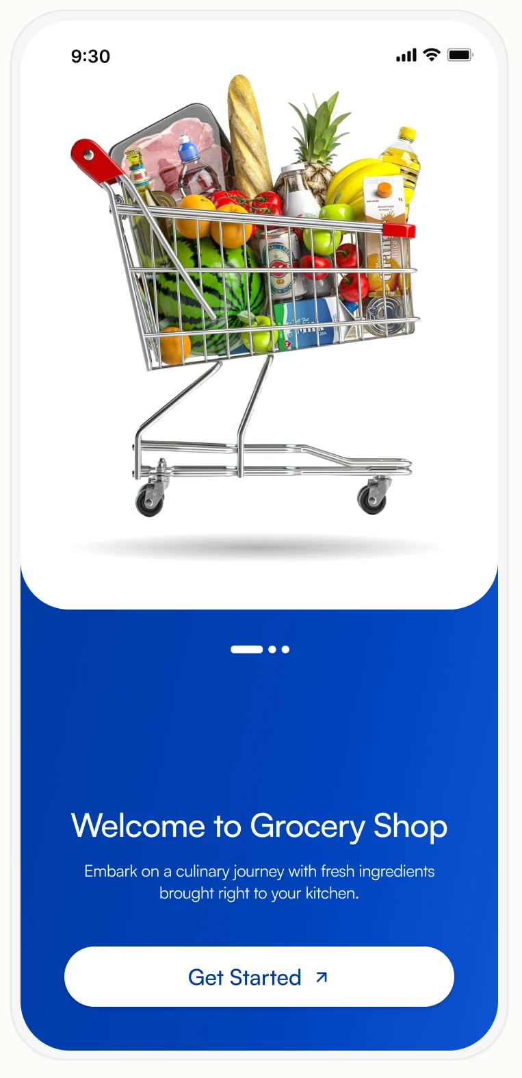
On boarding Page
A welcoming onboarding screen introducing the grocery experience and encouraging users to get started.
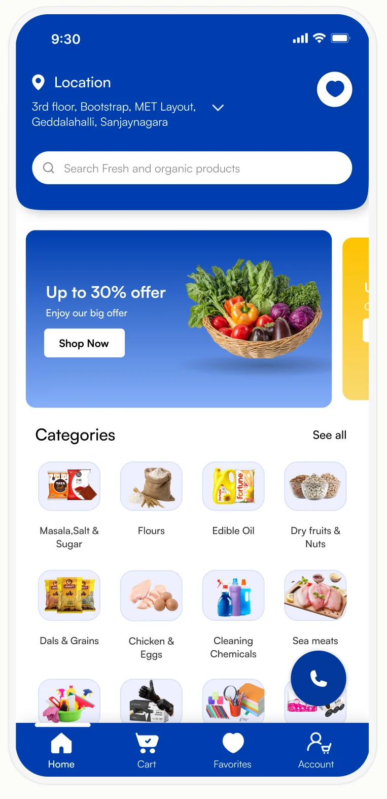
Home Page
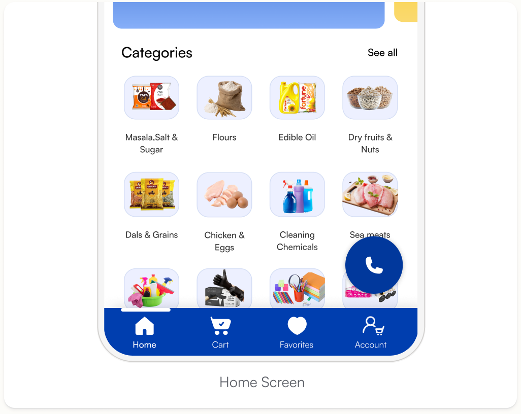
A centralized Home Screen showing categories, offers, quick access to search and navigation and also recently ordered Products.
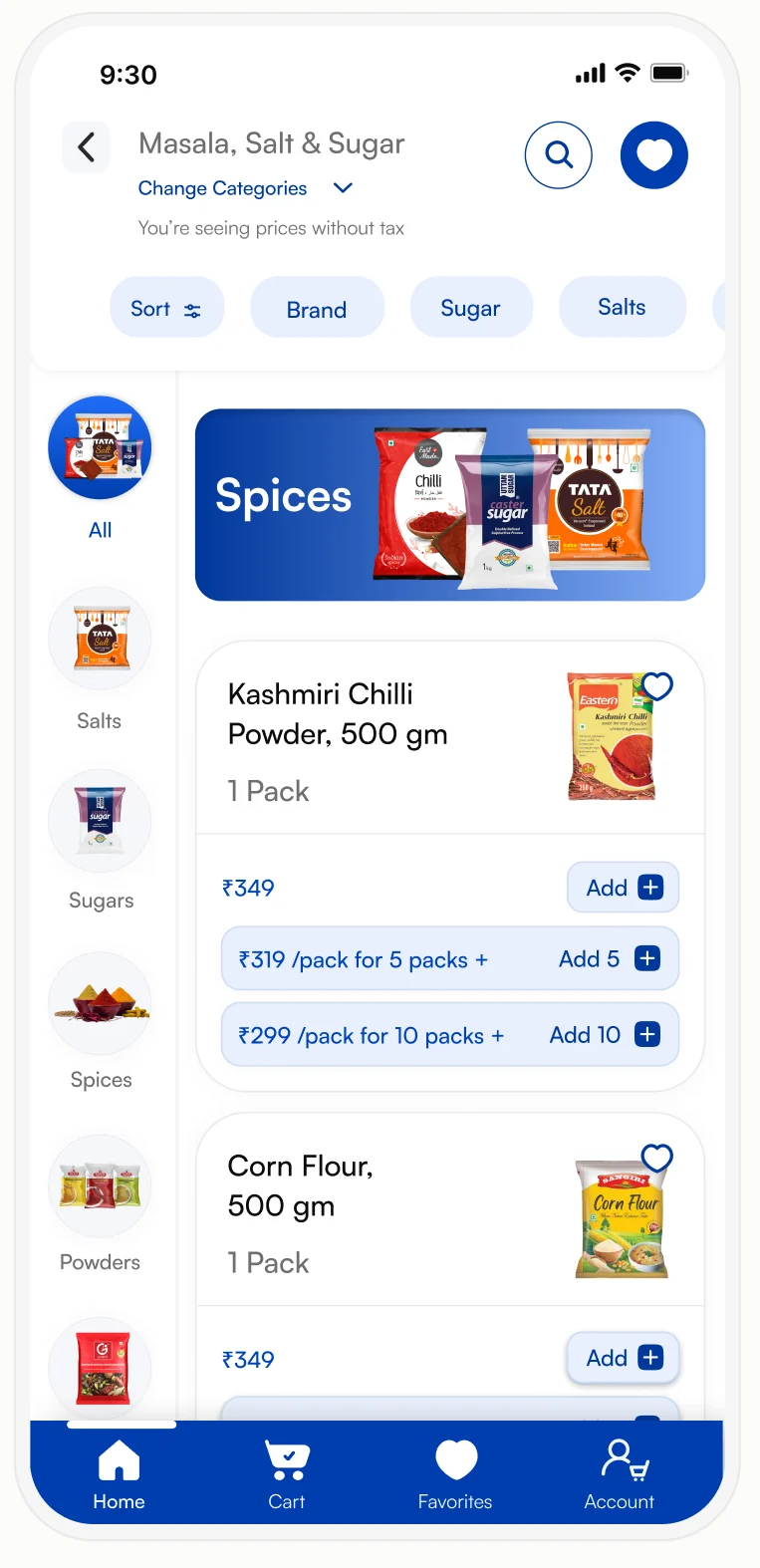
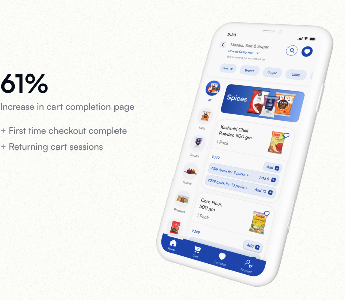
Categories Page
Users explore categorized grocery items, view product listings, and quickly add products to cart.
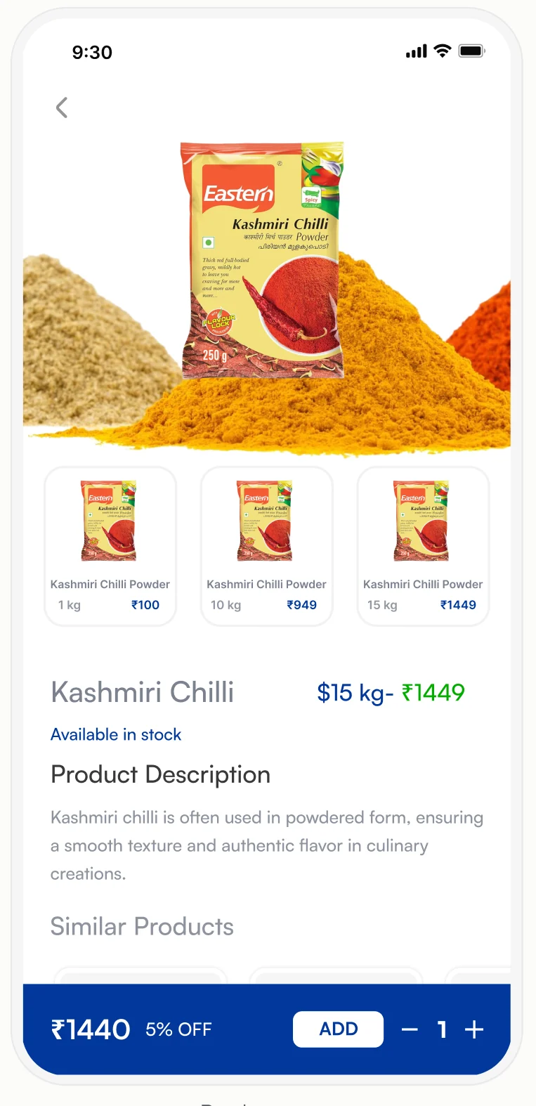
Product Details page
Displays product images, pricing, weight options, and detailed descriptions to help users make purchase decisions.
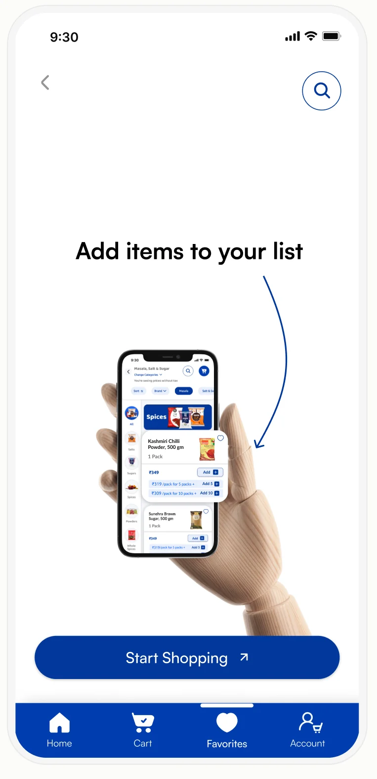
Favorites Page
Users save favorite items and quickly add products to their shopping list for faster purchases.
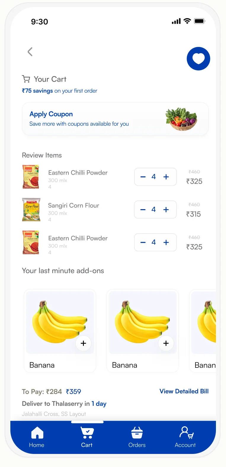
Cart Screen
Last Minute Add-ons — suggested products at the cart stage increase average order value without disrupting the checkout flow.
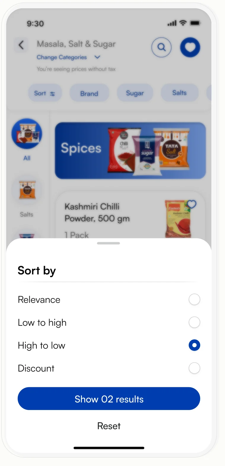
Sort by Modal
Sort products by relevance, price, or discounts to find the most suitable items quickly and efficiently.
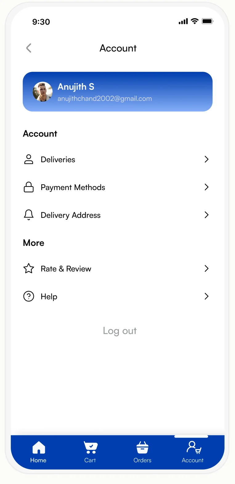
Account Page
Manage profile details, delivery addresses, payment methods, and app preferences from a centralized and easy-to-navigate account dashboard.
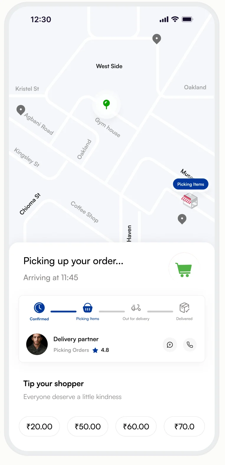
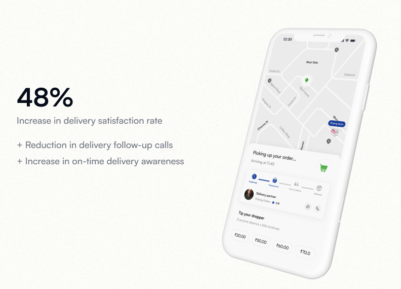
Order Tracking page
Track your order in real time with map updates, delivery status, and estimated arrival information for better transparency.
Explore More
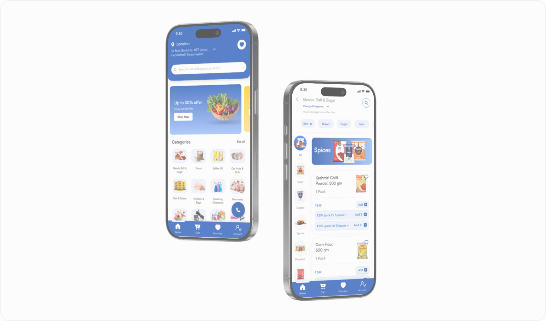
Get My Stock
A 0 to 1 B2B ordering app for small retailers — problem framing through to a shipped first release.
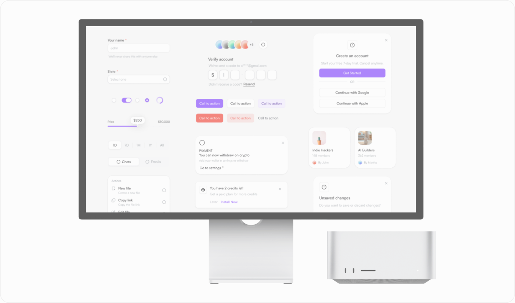
Aero UI Design System
A component library and token system built to keep a fast-moving product visually consistent.
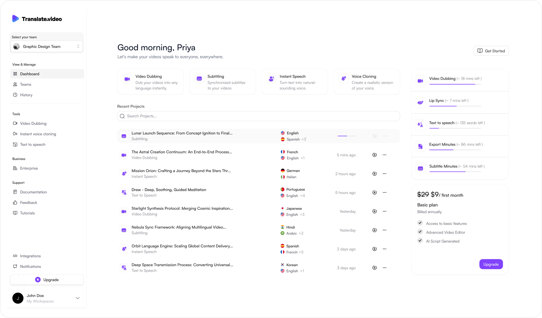
Translate.video V2
Rethinking an AI video localization platform across dashboard, editor, timeline and export.