Due to a signed NDA, the work displayed is not an exact representation of the real design and is provided only as a conceptual reference.
Design System for Vitra.AI
Collaborated with the Senior Product Designer across the full product lifecycle — from problem framing and user flows to wireframes, interaction design, and the final UI/visual language. Contributed to building the reusable component system and partnered with engineers to deliver a strong first release and a foundation for future iterations.
UX/UI Designer
2025 — 2026
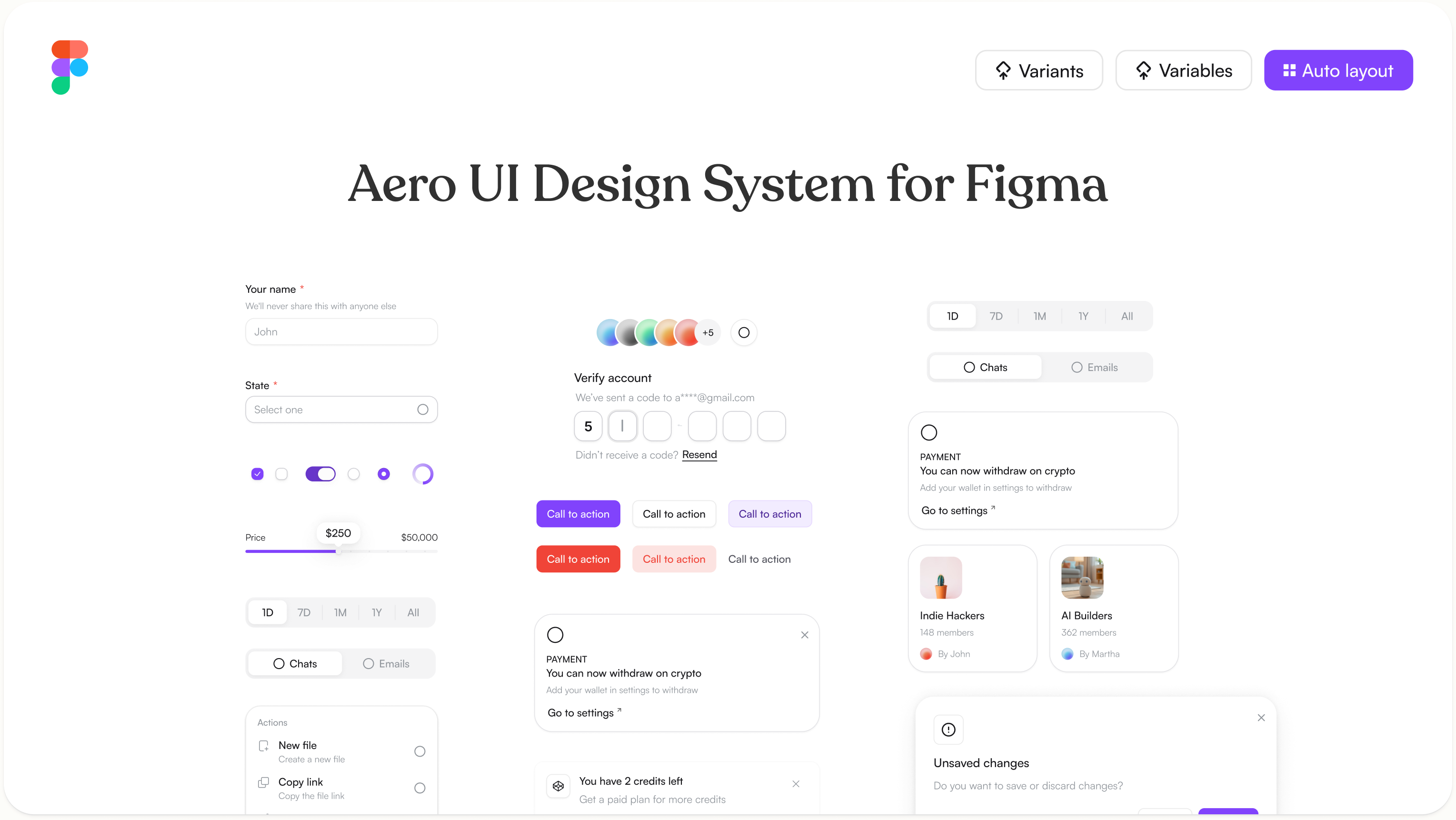
I collaborated with the Senior Product Designer on the end-to-end design of a Design System for Vitra.AI, contributing across the full product lifecycle from problem framing and user flows to wireframes, interaction design, and the final UI/visual language.
Timeline
Nov 2025—Jan 2026
Platform
Across All Products
My Role
UX/UI Designer
Tools used
Figma, React JS
Introduction
Vitra.AI is an AI-powered platform that helps teams translate, localize, and adapt content across multiple languages at scale. As the product grew, the need for a consistent, scalable design language became critical one that could support multiple product surfaces while maintaining visual and functional coherence across the entire experience.
In this project, we built the design system from the ground up, establishing a shared foundation that would serve both the current product and future iterations.
My Role
I worked alongside the Senior Product Designer, contributing across the full lifecycle of the design system from early problem framing and information architecture through to component design and final handoff. I was actively involved in shaping the visual language, building reusable components, and collaborating closely with engineers to ensure a smooth and accurate implementation.
Problem
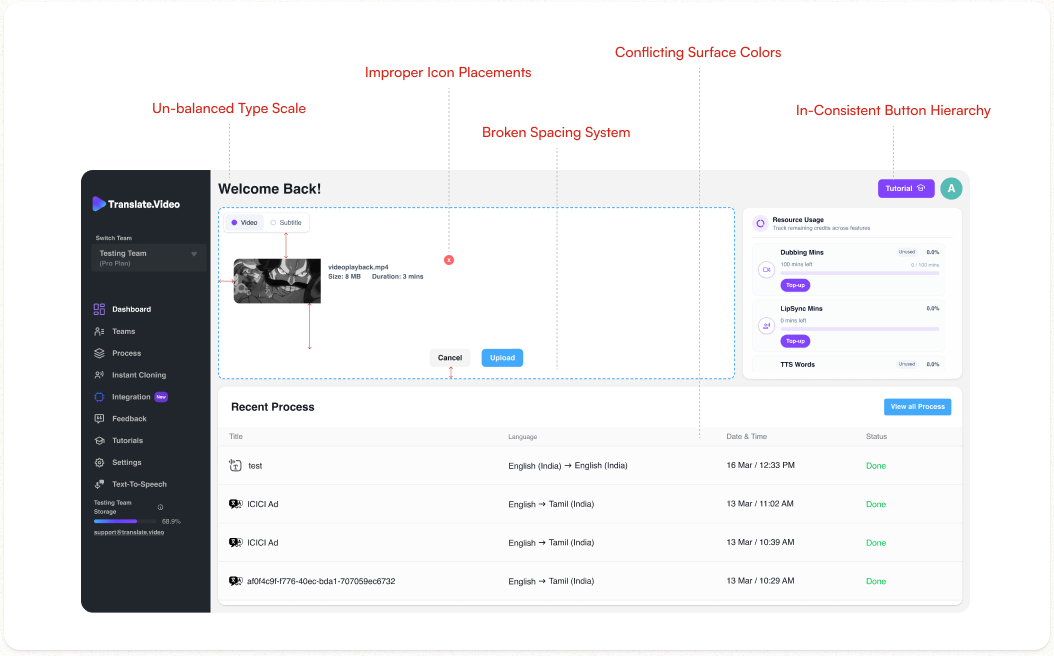
As Vitra.AI’s product expanded, design and development teams were working without a shared system, leading to inconsistencies across the UI. Here are the key problems with the existing experience:
PROBLEM #01
Un-balanced Type Scale
Designers and developers were building UI elements independently, the heading, nav labels, table headers, and body text are all inconsistent in size and weight, with no clear typographic hierarchy governing them.
IMPACT
Typography is the primary tool for guiding a user's attention through a screen. Without a defined type scale, every section competes for the same visual weight nothing feels more important than anything else.
PROBLEM #02
Broken Spacing System
The upload card, resource usage card, and data table all use different internal padding and gaps spacing decisions were made per component rather than from a shared token system.
IMPACT
Inconsistent spacing is one of the hardest problems to fix, because it touches every single component in the product. Without spacing tokens, every new component a designer creates will default to a different value, and every developer will interpret spacing from the design file differently.
PROBLEM #03
In-consistent Button Hierarchy
Upload uses a blue filled button, Top-up uses a purple filled button, and Cancel is un-styled text all on the same screen with no defined rule for when to use which style.
IMPACT
When users can't visually distinguish a primary action from a secondary one, they hesitate. In a product built around fast, repetitive workflows like uploading and processing files, that hesitation adds up.
PROBLEM #04
Conflicting Surface Colors
The dark sidebar, white content cards, and grey background have no defined elevation system or surface hierarchy and also they coexist without a clear rule in the product.
IMPACT
Without a surface system, the layout has no reliable way to communicate depth, focus, or containment. Users struggle to distinguish interactive areas from static ones, and the overall interface feels assembled rather than designed.
Issues Solved
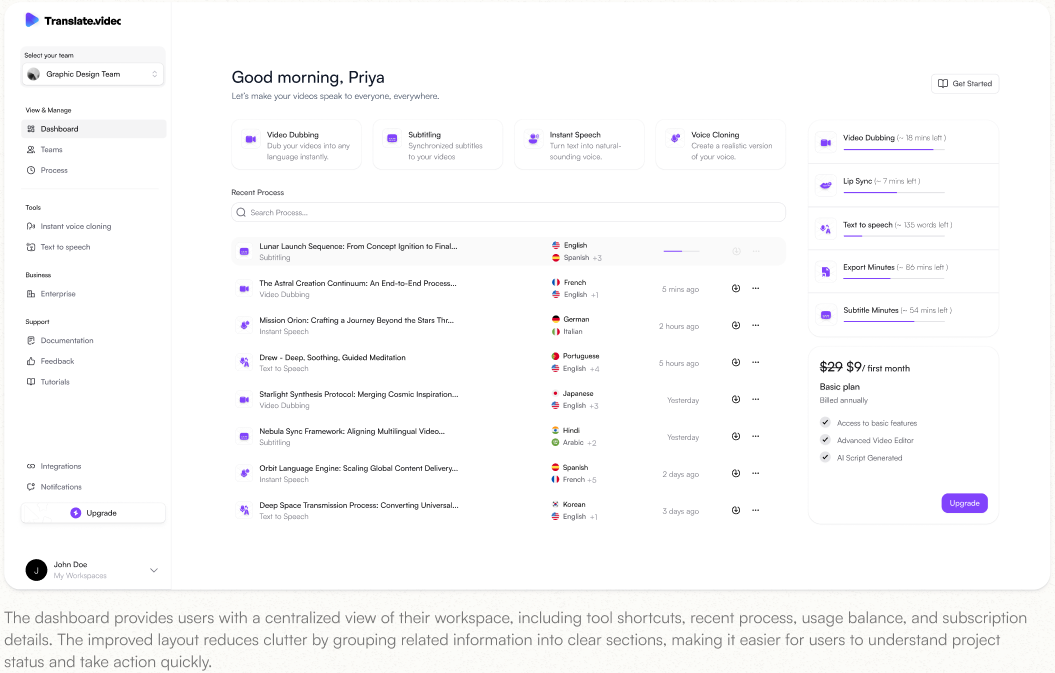
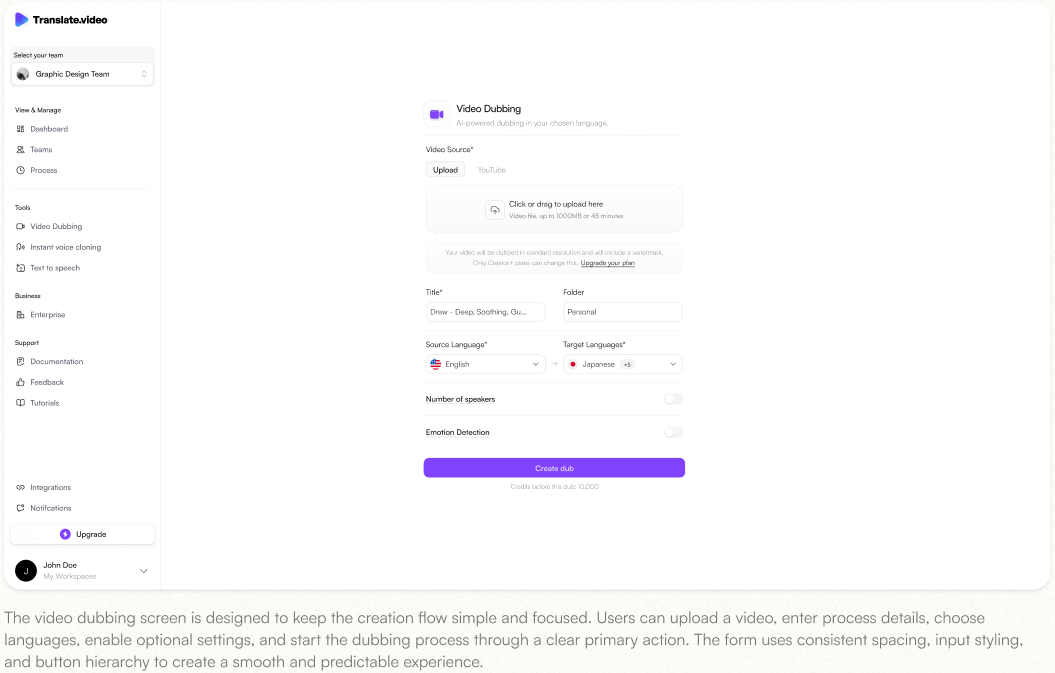
The redesigned dashboard creates a cleaner, more structured workspace where users can access tools, manage projects, track usage, and upgrade easily. The workflow screen follows the same design system, making video dubbing simple with a focused upload, language selection, settings, and creation flow.
SOLUTION #01
Balanced Type Scale
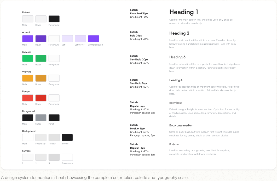
A consistent type scale was applied across headings, navigation labels, cards, tables, form fields, and body text. This created a clear visual hierarchy and made the dashboard easier to scan.
IMPACT
Compared to the old dashboard, where text sizes felt inconsistent and every section competed for attention, the new type system helps users quickly identify important areas like recent projects, tool cards, usage balance, and primary actions.
SOLUTION #02
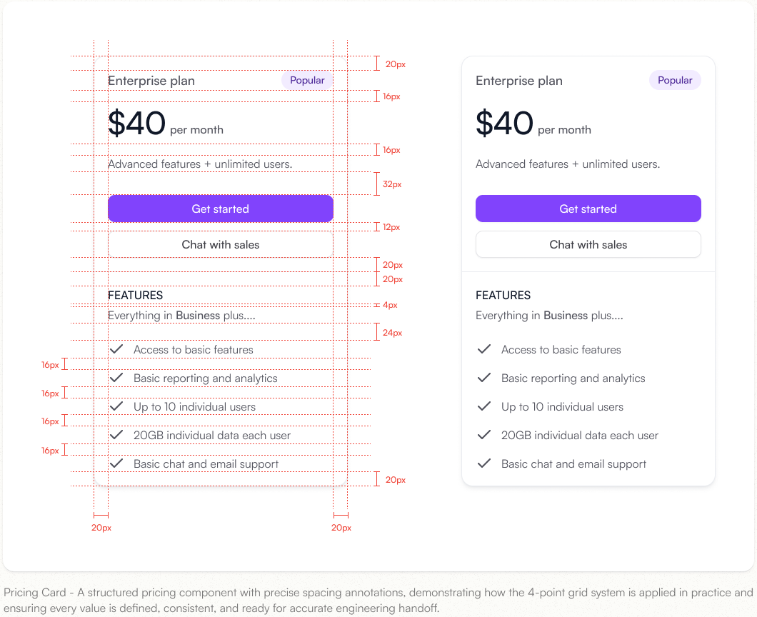
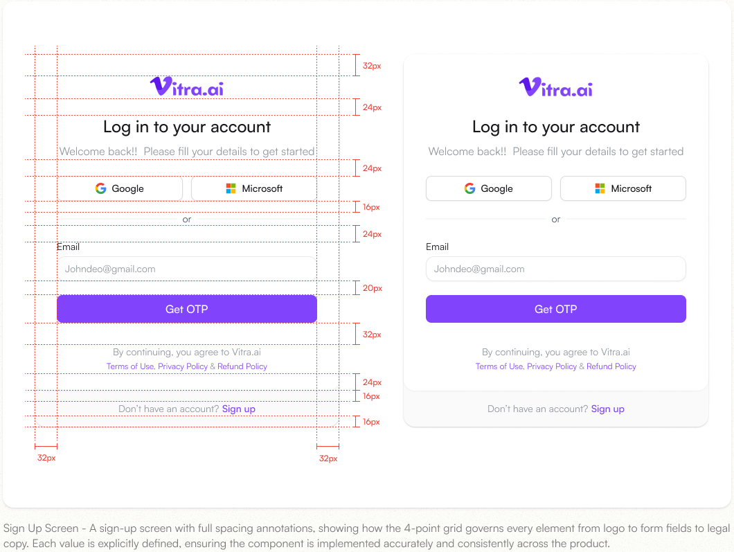
Consistent 4px Grid Spacing
The interface was rebuilt using a 4px spacing system to keep padding, gaps, card spacing, and form alignment consistent across the dashboard and workflow screens.
IMPACT
The old UI felt uneven because each component had different spacing rules. The new layout feels more organized and predictable, helping users move through the dashboard without visual clutter or confusion.
SOLUTION #03
Clear Button Hierarchy
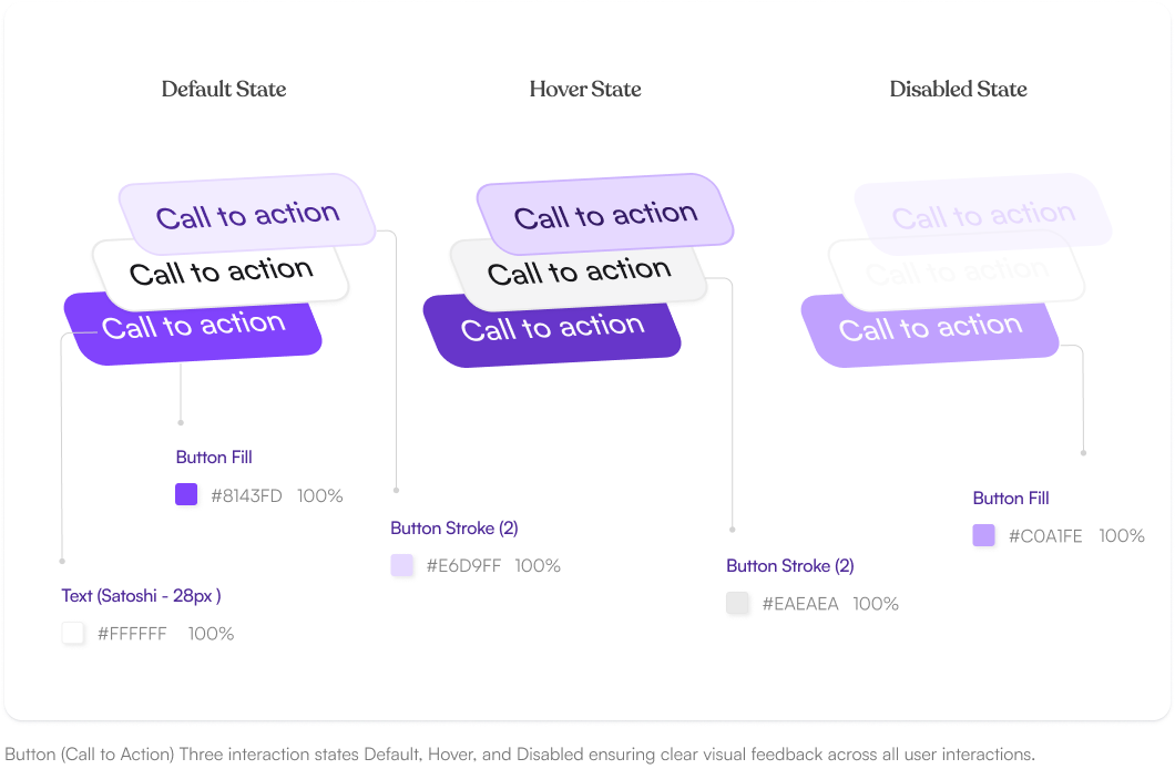
Primary, secondary, and supporting actions were redesigned with clear visual differences. Key actions like Create Dub and Upgrade are now more visible, while less important actions remain subtle.
IMPACT
In the old dashboard, users could not easily distinguish between main actions and secondary actions. The new button hierarchy guides users toward the next step faster and reduces hesitation during tasks like uploading, creating, or upgrading.
SOLUTION #04
Refined Color System
The color system was simplified using one primary color, one secondary color, and neutral shades for backgrounds, borders, and text. This created a cleaner and more controlled visual style.
IMPACT
The old dashboard used colors without a clear system, making the interface feel busy and inconsistent. The new color system improves focus, separates interactive elements from static content, and gives the product a more polished and professional look.
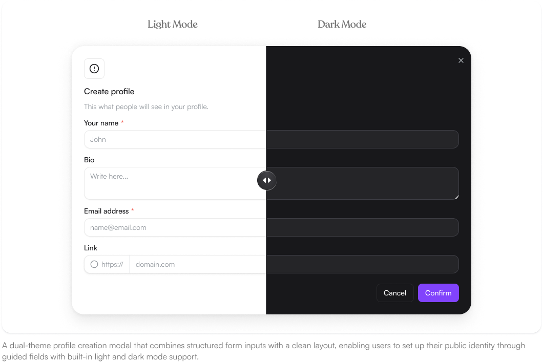
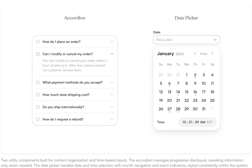
Components
As Vitra.AI’s product expanded, design and development teams were working without a shared system, leading to inconsistencies across the UI. Here are the key problems with the existing experience:
Spacing
We established a base-4 spacing token system a fixed set of values (4, 8, 12, 16, 20, 24, 32, 48px) that every component and layout is built from. This replaced the padding decisions that were causing inconsistencies across the product, ensuring whitespace feels intentional and consistent regardless of who designed or built the screens.
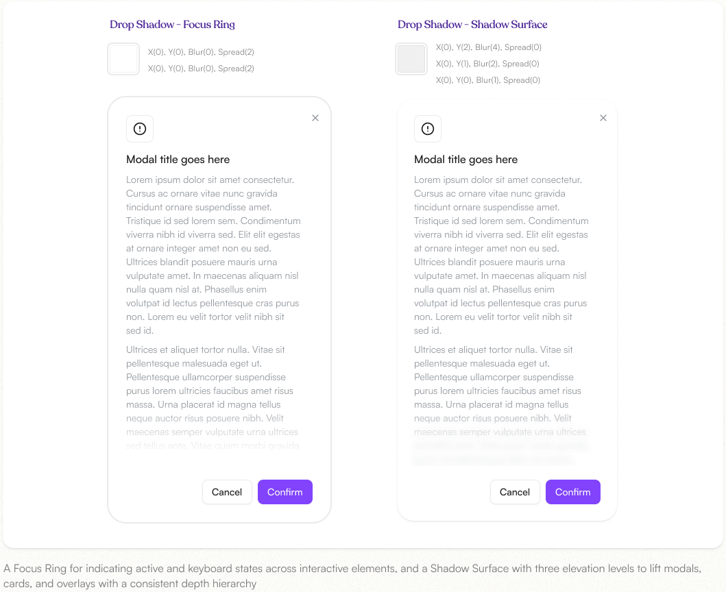
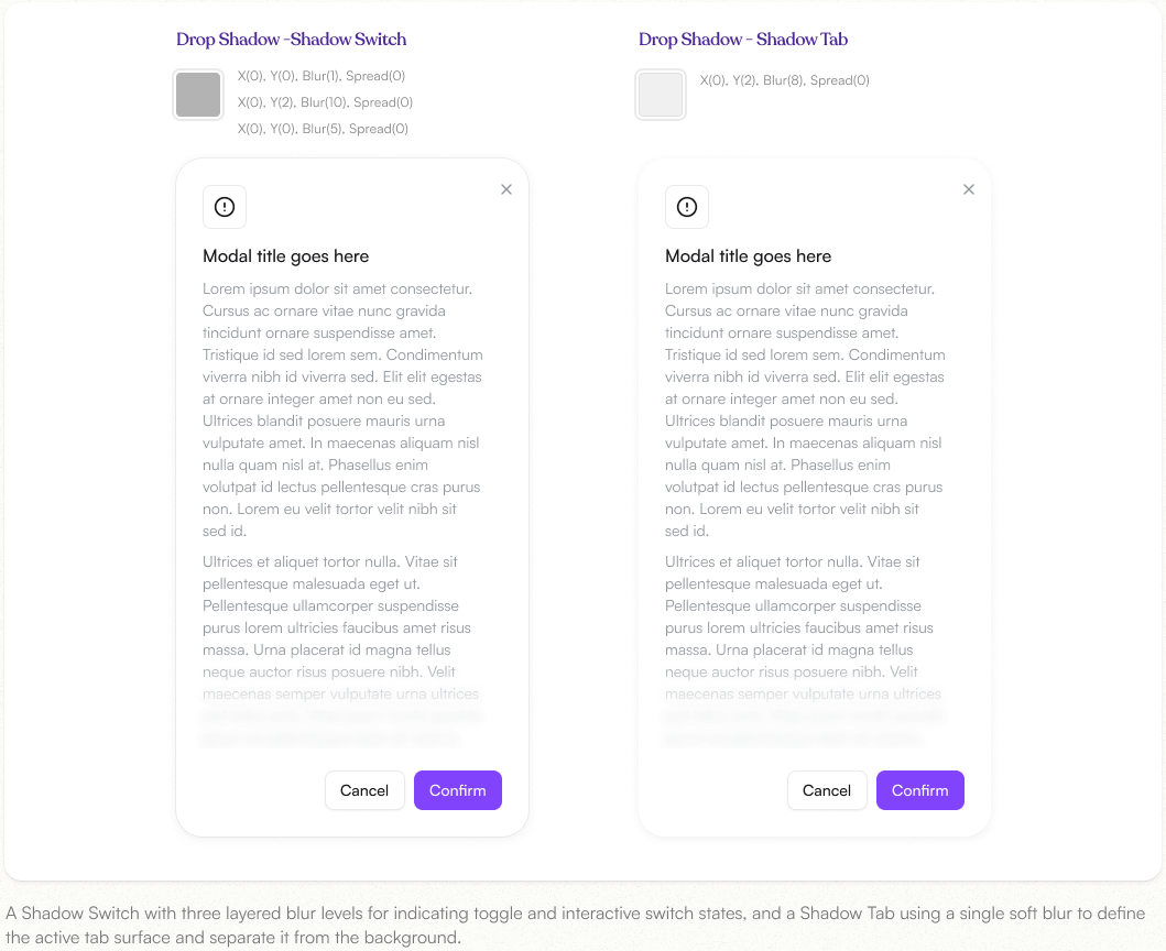
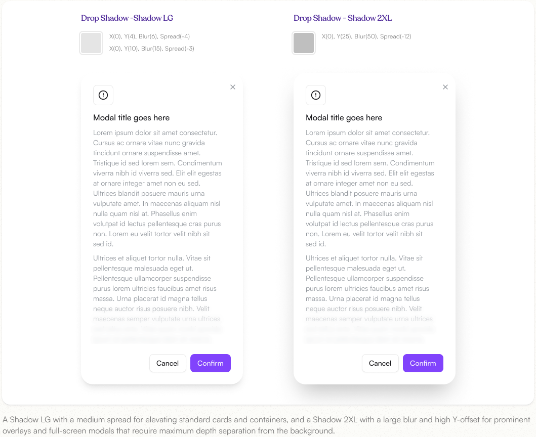
Drop Shadow
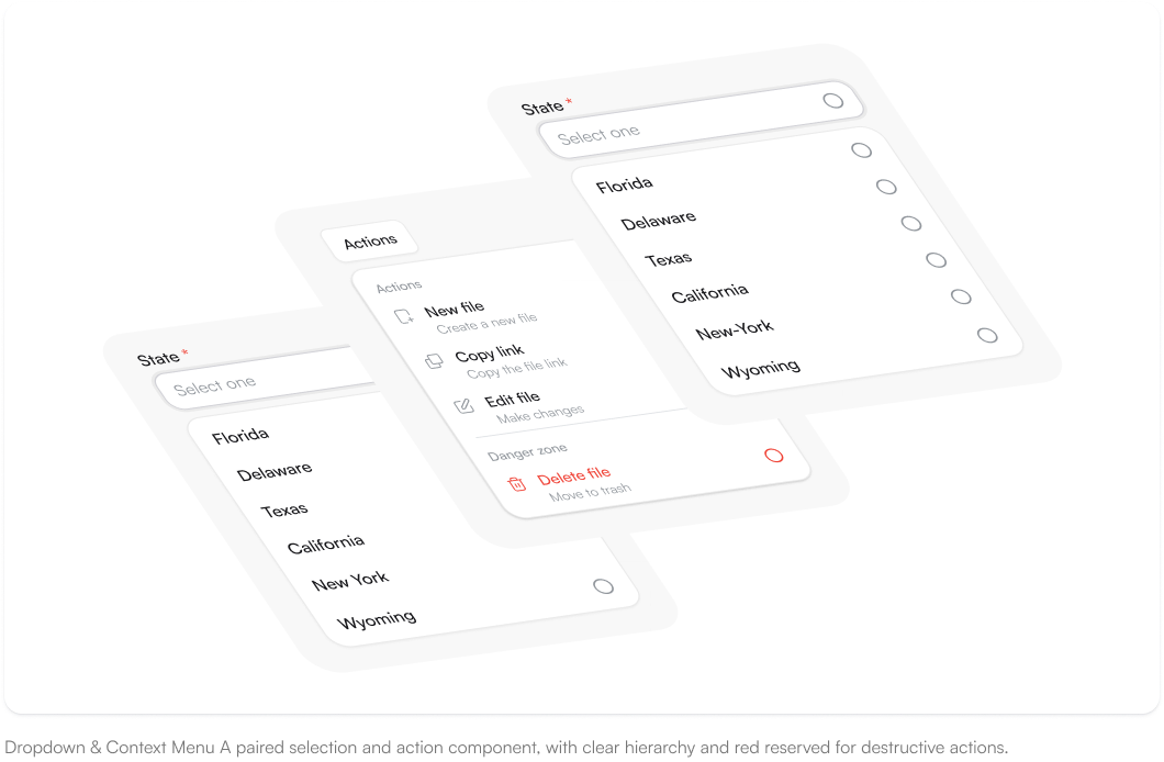
A defined set of shadow tokens used to communicate elevation and depth across the product. Each level is intentionally scoped from subtle card lifts to prominent modal overlays ensuring depth is applied consistently rather than decided on a case-by-case basis.
Explore More
Get My Stock
A 0 to 1 B2B ordering app for small retailers — problem framing through to a shipped first release.
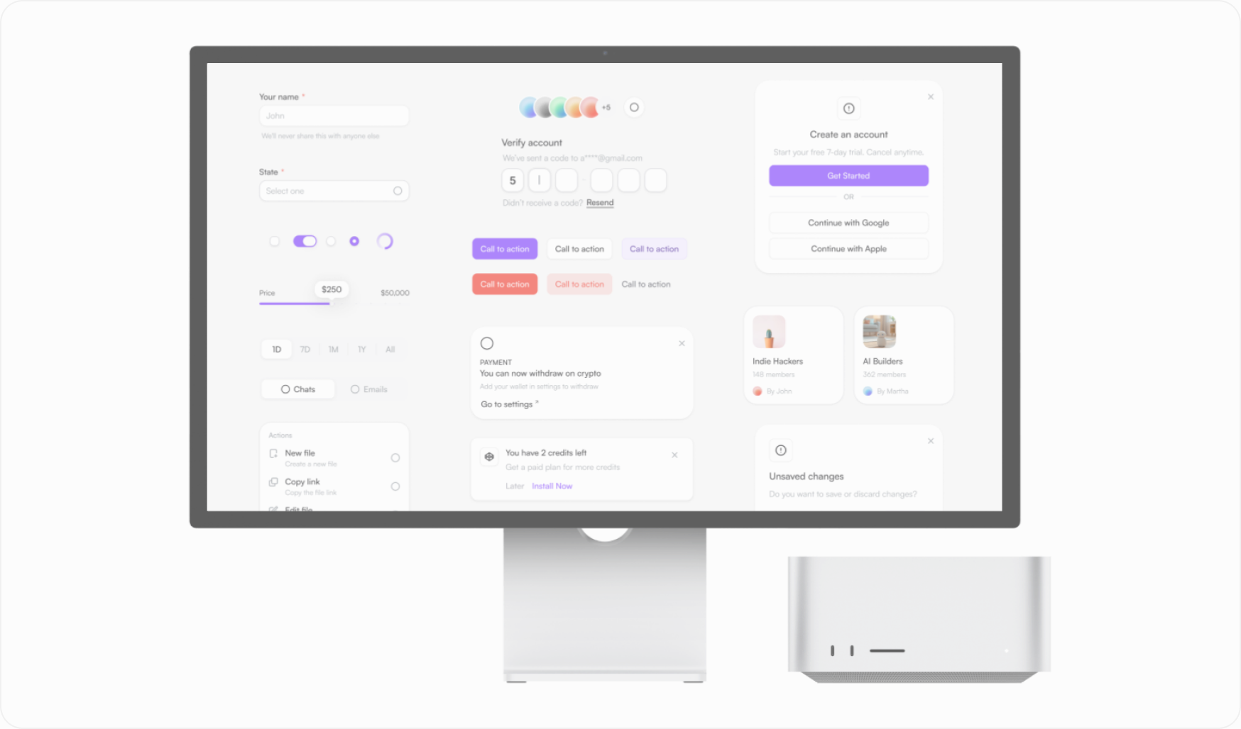
Aero UI Design System
A component library and token system built to keep a fast-moving product visually consistent.
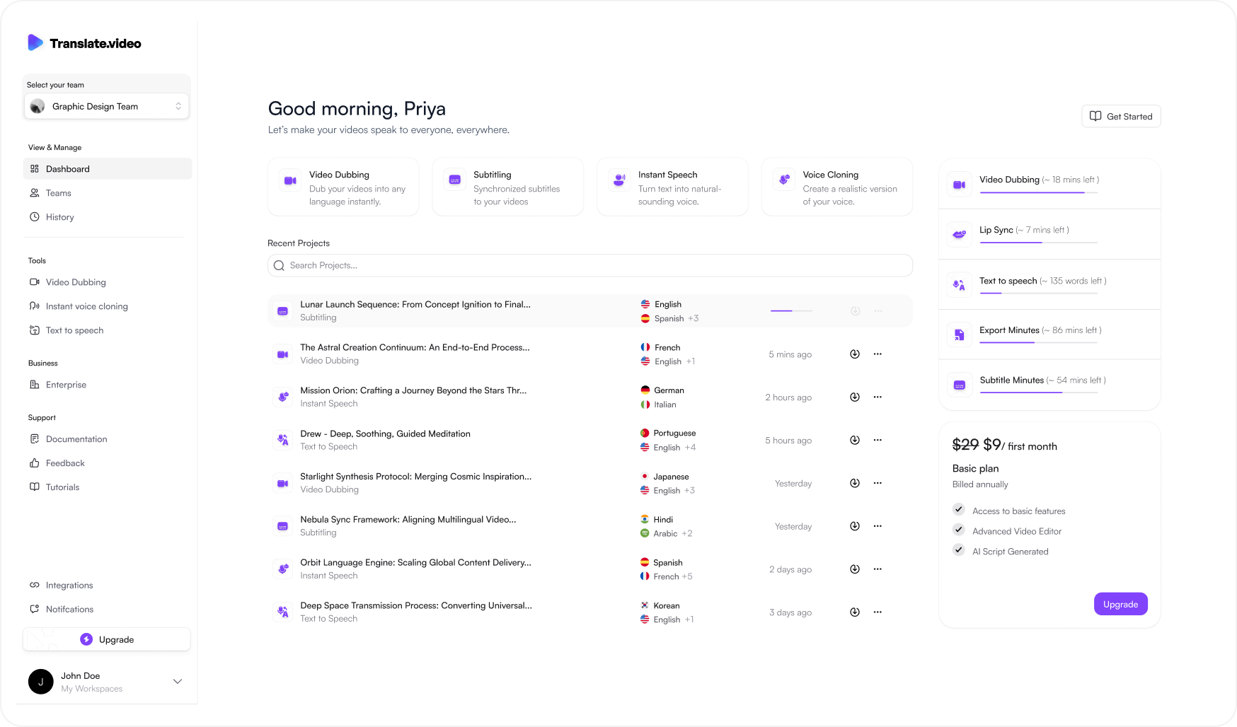
Translate.video V2
Rethinking an AI video localization platform across dashboard, editor, timeline and export.